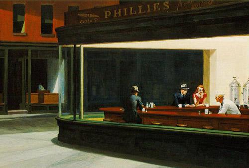
This is the second painting which I am weaving a story around. It is quite a predictable choice – Hopper’s paintings, in general, are predictable choices because of their intriguing cast of characters often give rise to the inevitable questions of who and why. I also thought that a rather cliched choice would also make the scene more instantly recognisable, which is one of my primary intentions in making this series of short story comics. So many questions remain; what style to use, whether to use limited colour or to stick to my usual sombre monochromatic palette, and so on. I’m currently scripting the story and it will be longer than the previous Card Players, although I want to draw the line at twenty pages. I do not want it to drag on into one of those interminable projects which I’ll tire of before finishing. The burning question is, can I hold the viewer’s interest for twenty pages if most of the action goes on in the protagonist’s head? The trouble with the sort of comics I like making is that I am more interested in interiority than in external action.
I started sketching out the first page today and inked two of the panels. Sadly, the heat and eyestrain are both conniving to make me abandon this work for the next few days, I do not feel very inspired anyway and just feel very lethargic.
Wikipedia has provided some useful basic information. Edward Hopper’s diner, now demolished, once stood in a place now called Mulry Square, at the intersection of 7th Ave S, Greenwich Ave and West 11th St in New York City. It is easy to take a virtual trip there using Google Streetview, and the sad, vacant lot is presumably where the diner once stood

Recent Comments